Brand Board — single sheet



A civic identity built for legibility first — every voter in the county has to read it, in twelve languages, at forty miles an hour.
Owner — LA County Registrar-Recorder/County Clerk.
Program — VSAP, the county's vote-center model.
Face — Clear Sans. One family, three weights.
Voice — plain and procedural. Encouraging, never partisan.
Program — VSAP, the county's vote-center model.
Face — Clear Sans. One family, three weights.
Voice — plain and procedural. Encouraging, never partisan.
Colour
Spark
#FCC227 · CTAs, rules, numerals
Interaction
#2DAAE7 · links, icon chips
Structure
#213F80 · headings, footer
Ground
#FFFFFF · most of any page
Target proportion on a typical page — white 62 · navy 24 · blue 10 · yellow 4.
Type
Clear Sans
Bold · Regular · Book.
No serif, no display face. Hierarchy comes from size, weight and colour only.
No serif, no display face. Hierarchy comes from size, weight and colour only.
Iconography
In the wild
Brand Guide — page 1 / 18

Registrar-Recorder / County ClerkBrand & Style Guide
Los Angeles County · VSAP
Voting
Solutions for
All People.
Solutions for
All People.
The identity system behind LA County's vote-center model — colour, type, icons, badges and out-of-home, written down so a hundred vendors can build the same thing.
LAVote.net
Cover01
Brand Guide — page 2 / 18
ContentsWhat is in this guide
Contents
Eighteen pages. Read 04–07 before you design anything; the rest is reference you pull when you need it.
How to use it
Colour and type are fixed. Everything else is guidance.
When a rule and accessibility conflict, accessibility wins.
Ballot-facing material has its own legal review — this guide does not override it.
When a rule and accessibility conflict, accessibility wins.
Ballot-facing material has its own legal review — this guide does not override it.
03Positioning
04Colour — core
05Colour — application
06Typography
07Type scale & rules
08Icons — guidance
09Icons — service
10Badges & seals
11The sticker
12Out of home — billboard
13Out of home — transit
14Social media
15Print & explainers
16In the field
17Voice & messaging
18Quick reference
Contents02
Brand Guide — page 3 / 18
01 — FoundationsPositioning
Government
that reads
like a sign.
that reads
like a sign.
Nobody visits an elections site for pleasure. They arrive with one question and a deadline. The identity's job is to answer it in the fewest possible moves — and to look official enough that the answer is believed.
Principles
01 Legible before beautiful.
02 One question per screen, one action per block.
03 Twelve languages is the default, not a feature.
04 Yellow points. Navy organises. Blue is clickable.
05 Encourage turnout freely — never a candidate or a measure.
02 One question per screen, one action per block.
03 Twelve languages is the default, not a feature.
04 Yellow points. Navy organises. Blue is clickable.
05 Encourage turnout freely — never a candidate or a measure.
Audience
5.6 million registered voters · 88 cities · 12 mandated languages · a median reading age well below college. Design for the hardest case and the rest is free.
What the brand promises
Your ballot will be counted, you can vote anywhere in the county, and finding out how takes under a minute.
Say
Vote at ANY vote center
Vote Centers open February 22 – March 3
No postage necessary
Vote Centers open February 22 – March 3
No postage necessary
Keep out of it
Candidate or measure names
Anything that reads as a position
Urgency the deadline doesn't support
Anything that reads as a position
Urgency the deadline doesn't support
Foundations03
Brand Guide — page 4 / 18
02 — ColourCore palette
Spark
#FCC227
CTAs, rules, numerals, the one thing you must notice
Interaction
#2DAAE7
Links, icon chips, focus rings
Structure
#213F80
Headings, footer, nav, seals
Ground
#FFFFFF
The majority of any page
Proportion
White 62 · navy 24 · blue 10 · yellow 4. Yellow is the smallest number on purpose — it stops working the moment there are two of them on a screen.
Support
Ink
#1B2438
Slate
#5b6b8c
Sky
#E4F1FB
Wash
#F2F6FC
Line
#d7dceb
Colour04
Brand Guide — page 5 / 18
02 — ColourApplication & contrast
Contrast pairs that pass
Navy on white
12.4:1
White on navy
12.4:1
Navy on spark
7.9:1
Ink on wash
14.1:1
Never
White on spark — 1.8:1
White on interaction — 2.4:1
Where each colour goes
One yellow button per view. If a second action needs weight, it gets the navy outline — not another yellow.
Colour05
Brand Guide — page 6 / 18
03 — TypographyOne family
Clear
Sans
Sans
Drawn for screen legibility at small sizes and open enough to survive a bus shelter at night. One family across web, print and signage — no serif, no display face.
Weights in use
Bold
Medium
Regular
Character set
ABCDEFGHIJKLM
NOPQRSTUVWXYZ
abcdefghijklmnopqrstuvwxyz
0123456789 &?!$%
NOPQRSTUVWXYZ
abcdefghijklmnopqrstuvwxyz
0123456789 &?!$%
Why it matters here
Open apertures — the 3, 8 and 6 stay distinct at 12px
Tall x-height carries Spanish, Tagalog and Vietnamese diacritics
Numerals are lining and tabular — ballot counts align
Ships free, so vendors have no excuse to substitute
Tall x-height carries Spanish, Tagalog and Vietnamese diacritics
Numerals are lining and tabular — ballot counts align
Ships free, so vendors have no excuse to substitute
Typography06
Brand Guide — page 7 / 18
03 — TypographyScale & rules
Scale
Display
52 / 1.04 · Bold
Vote at ANY Vote Center
Heading
30 / 1.14 · Bold
Marriage Licenses
Subhead
22 / 1.3 · Medium
Before you go
Body
16 / 1.62 · Regular
Vote centers open eleven days before Election Day.
Small
13.5 / 1.6 · Regular
No postage necessary on returned ballots.
Micro
11 / 1.4 · Bold caps
COUNTY CLERK · EYEBROW
Rules
Measure caps near 66 characters
Body never below 16px on web, 12pt in print
Sentence case for headings; caps only for micro labels
Hierarchy from size, weight and colour — never from a second typeface
No italics. They fail in most of the mandated scripts
No letter-spacing on body copy
No centred paragraphs longer than two lines
Body never below 16px on web, 12pt in print
Sentence case for headings; caps only for micro labels
Hierarchy from size, weight and colour — never from a second typeface
No italics. They fail in most of the mandated scripts
No letter-spacing on body copy
No centred paragraphs longer than two lines
Multilingual setting
Twelve languages share one layout. Set the longest translation first — usually Spanish or Tagalog — and let English sit loose. Never shrink type to make a translation fit; cut the sentence instead.
Typography07
Brand Guide — page 8 / 18
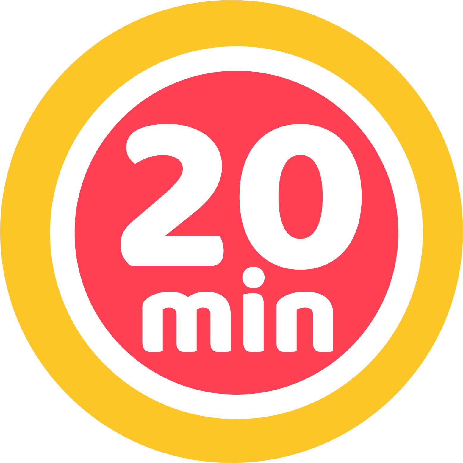
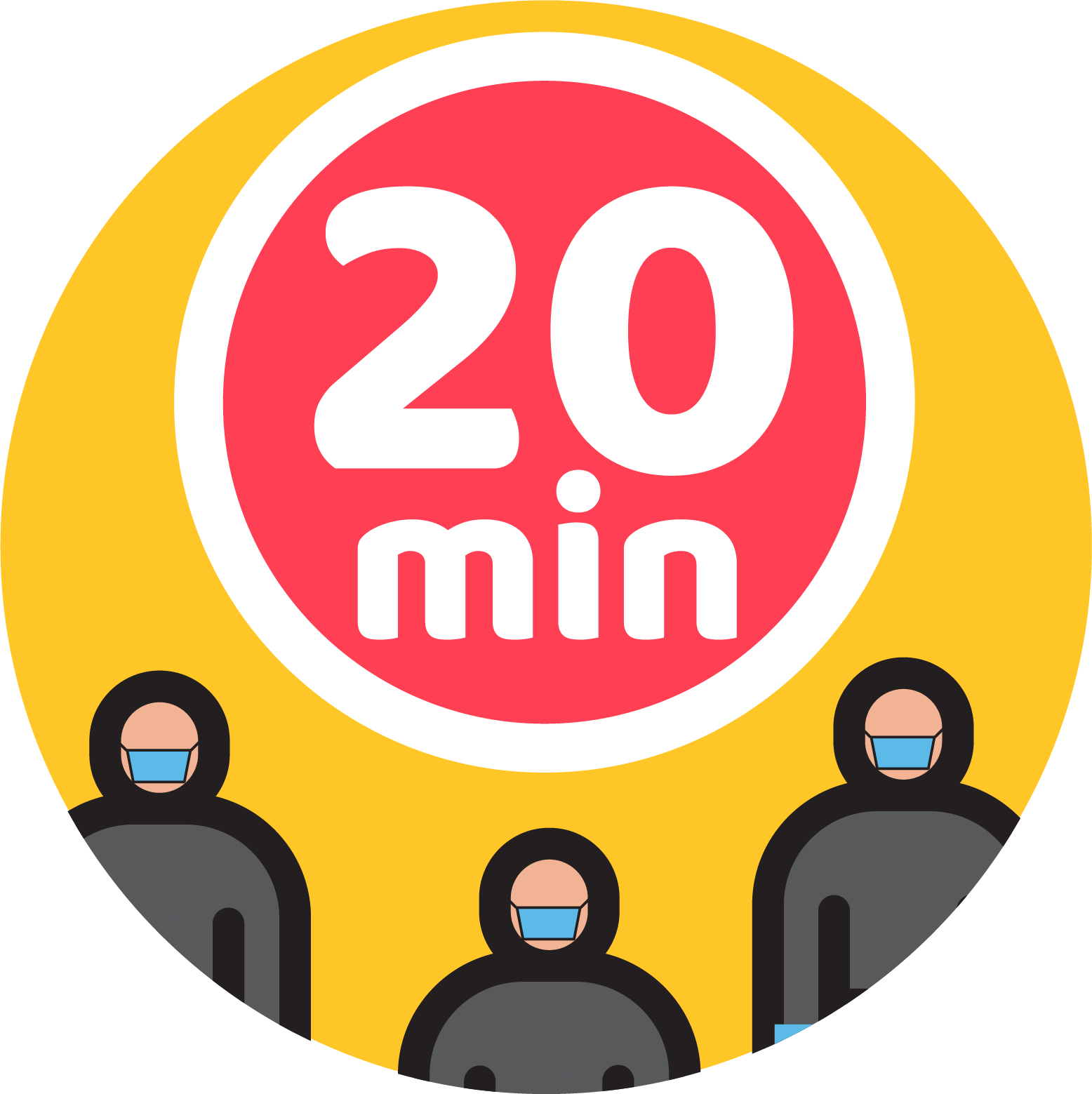
20-minute wait
 Capacity
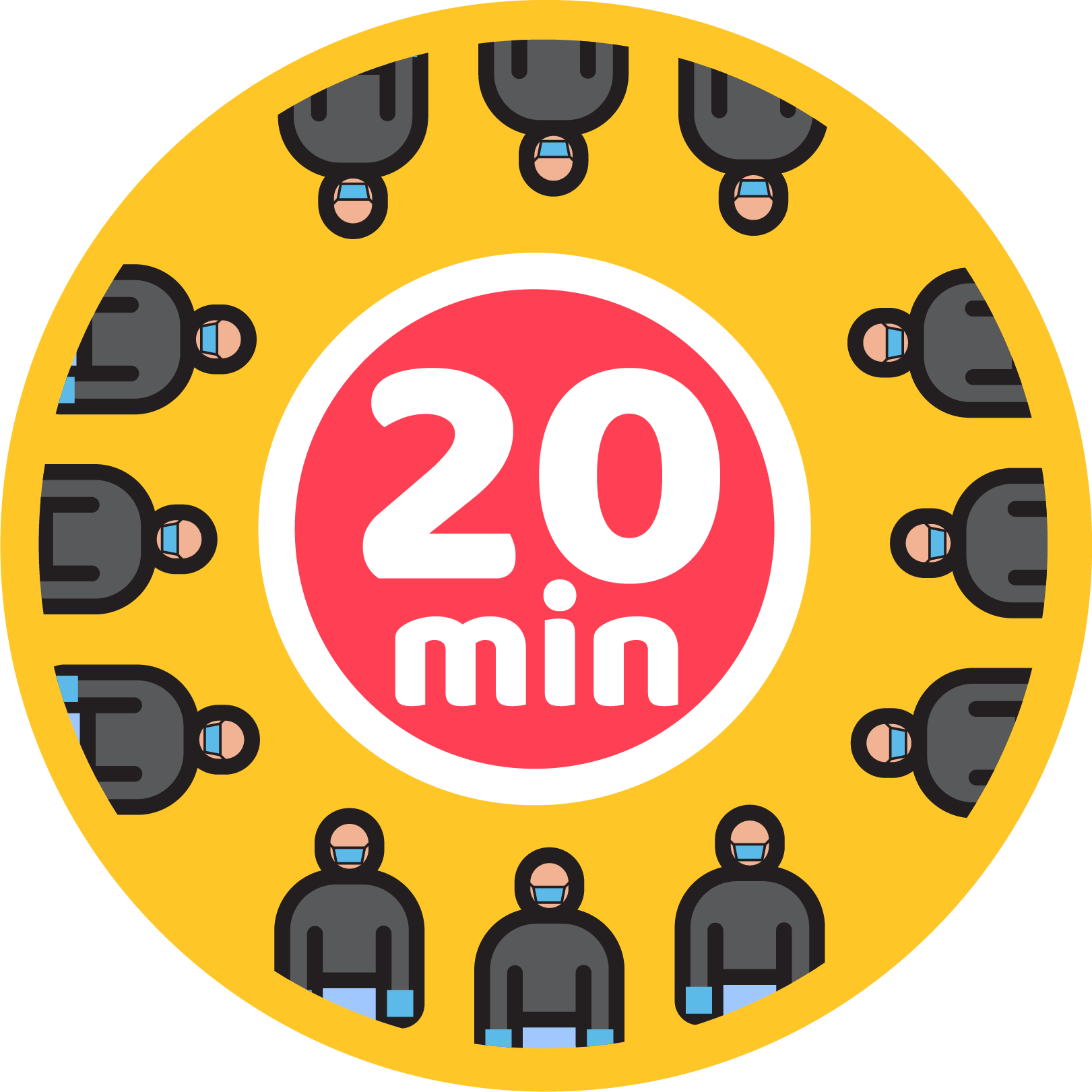 Spaced queue
Mask required
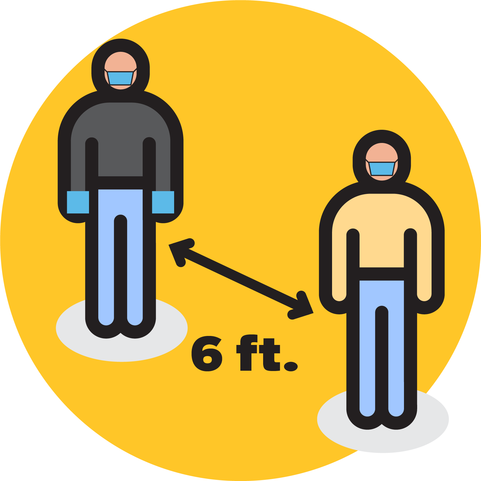
Six feet apart
 Livestream
04 — IconographyGuidance system
Yellow circle,
black line,
one idea.
black line,
one idea.
Guidance icons sit on a spark-yellow disc with a heavy black contour. They carry operational instructions — wait times, spacing, masks — and are readable from across a parking lot.
Rules
Disc is always #FCC227
Contour weight scales with the icon, never below 6% of diameter
Blue and coral are accents only
Never place on a coloured background
Contour weight scales with the icon, never below 6% of diameter
Blue and coral are accents only
Never place on a coloured background
20-minute wait
Capacity
Spaced queue
Mask required
Six feet apart
Livestream
Iconography08
Brand Guide — page 9 / 18

04 — IconographyService system
Ballot security
Sky disc · slate and periwinkle forms · spark accent
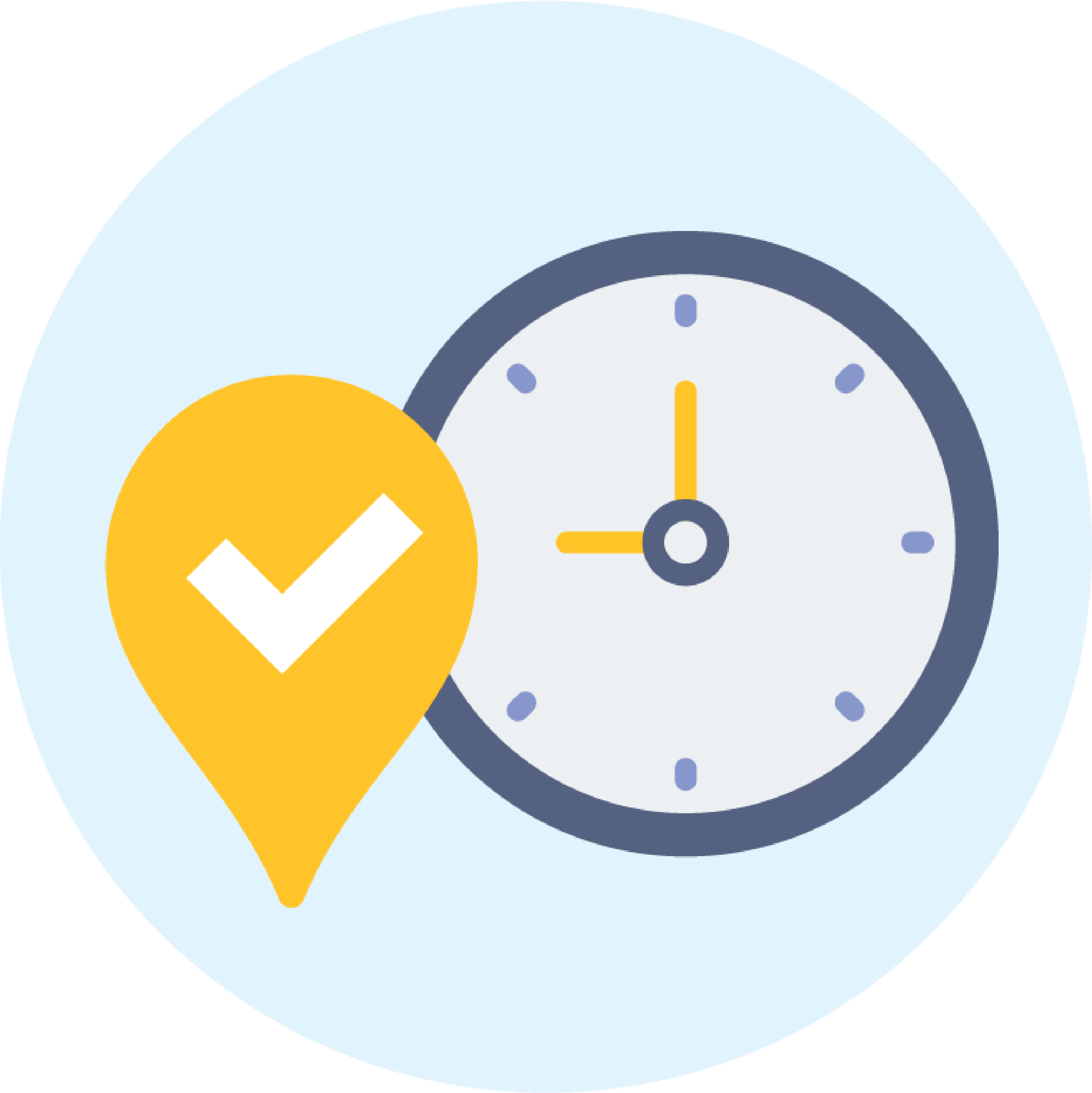
Locations & hours
Sky disc · slate and periwinkle forms · spark accent
County facilities
Sky disc · slate and periwinkle forms · spark accent
Mobile vote center
Sky disc · slate and periwinkle forms · spark accent
Sky circle for
the calm half.
the calm half.
Service icons describe how the county works rather than what to do right now. Softer palette, flatter forms, no heavy contour — they sit inside pages instead of shouting from walls.
Pairing
Never mix the two systems in one row. Guidance icons belong on signage and alerts; service icons belong in page content and wayfinding. If a layout seems to need both, it is really two layouts.
Minimum size
64px on screen. 0.75in in print. Below that the interior detail collapses and the disc reads as a dot.
Iconography09
Brand Guide — page 10 / 18

05 — MarksBadges & seals
Badges do the
vouching.
vouching.
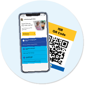
Where a page needs to say "this is official", a badge does it faster than a paragraph. Each one is a fixed lockup — the county seal, the service name, and nothing else.
Rules
Use as supplied. Never redraw, recolour or re-set the type
Clear space equals the height of the seal on all sides
Never stretch, rotate or add a drop shadow
Never place two badges side by side
Clear space equals the height of the seal on all sides
Never stretch, rotate or add a drop shadow
Never place two badges side by side
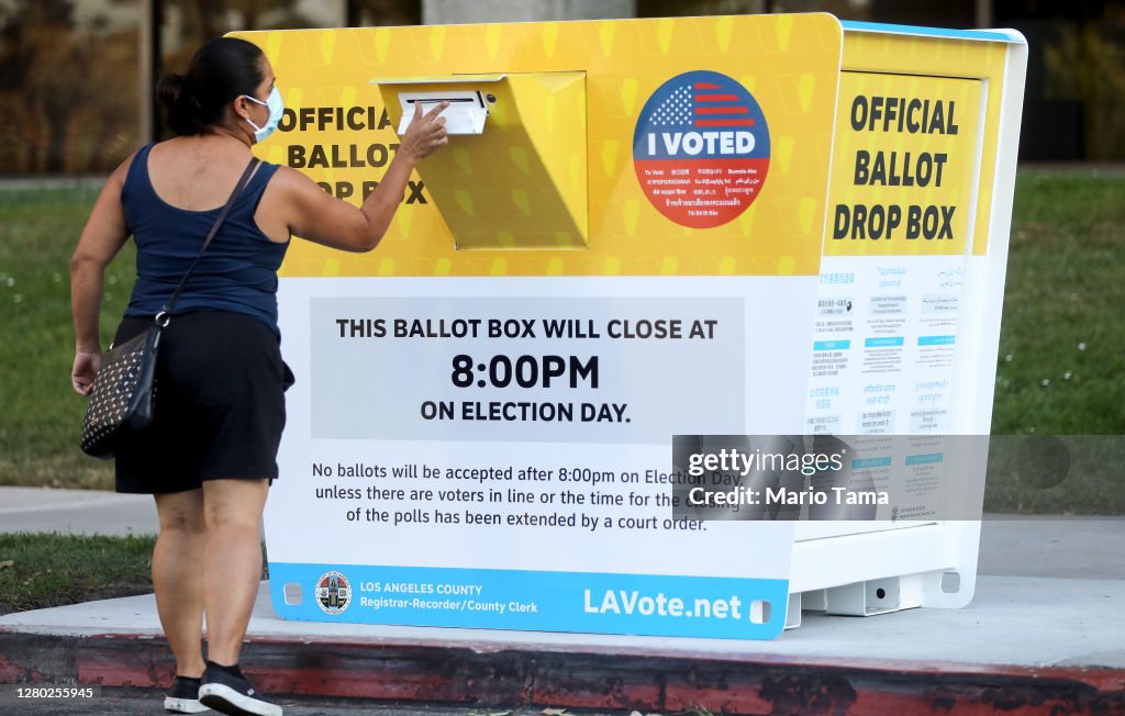
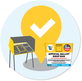
Official ballot drop box
Placed on every drop-box wrap and map pin
Interactive sample ballot
Print and mailer only — pairs with a live QR
Certified results
Results pages after canvass closes
Live
Election-night stream and live blog only
Marks10
Brand Guide — page 11 / 18
05 — MarksThe sticker
The only piece
anyone keeps.
anyone keeps.
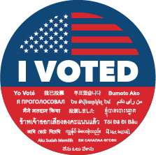
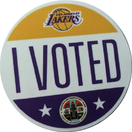
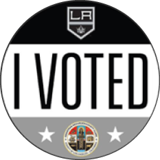
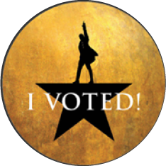
"I Voted" is the most-photographed object the county produces. It is also the one place the identity is allowed to loosen — co-branded editions with LA institutions have run every cycle since 2020.
Co-brand rules
"I VOTED" stays the largest element, always in the county's voice
Partner mark sits above, county seal below — never side by side
Two colours from the partner, maximum
No partner slogans, no sponsorship language
No political, ballot-measure or candidate partners, ever
Partner mark sits above, county seal below — never side by side
Two colours from the partner, maximum
No partner slogans, no sponsorship language
No political, ballot-measure or candidate partners, ever
Standard
Twelve languages
Lakers
2020 General
Kings
2020 General
Hamilton
Cultural edition
Specification
2.5in circle · matte vinyl · four-colour process · bleed 0.125in. The standard edition carries the phrase in the mandated twelve languages on the face; co-brand editions keep English only and put the translations on the sheet reverse.
Marks11
Brand Guide — page 12 / 18
06 — Out of homeBillboard
Structure
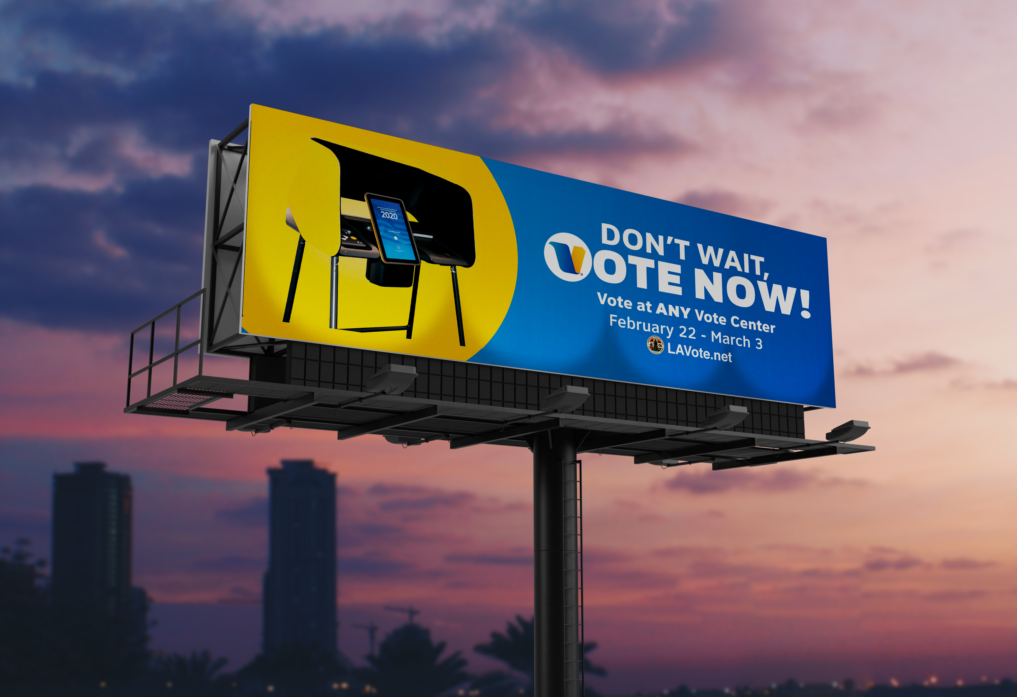
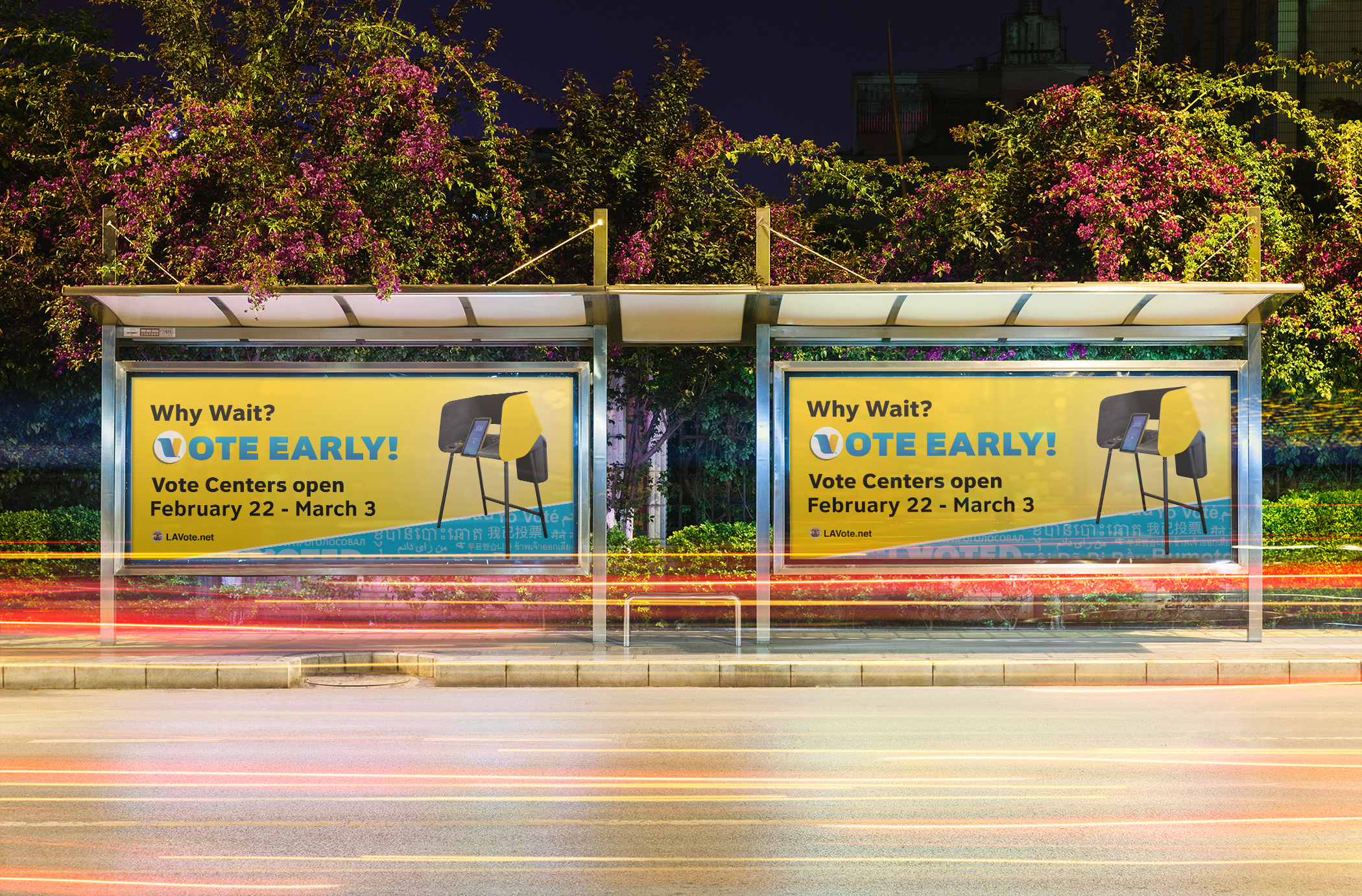
Yellow field left, navy field right, hard diagonal or circle between them. The device is the product photo, never a person.
Copy
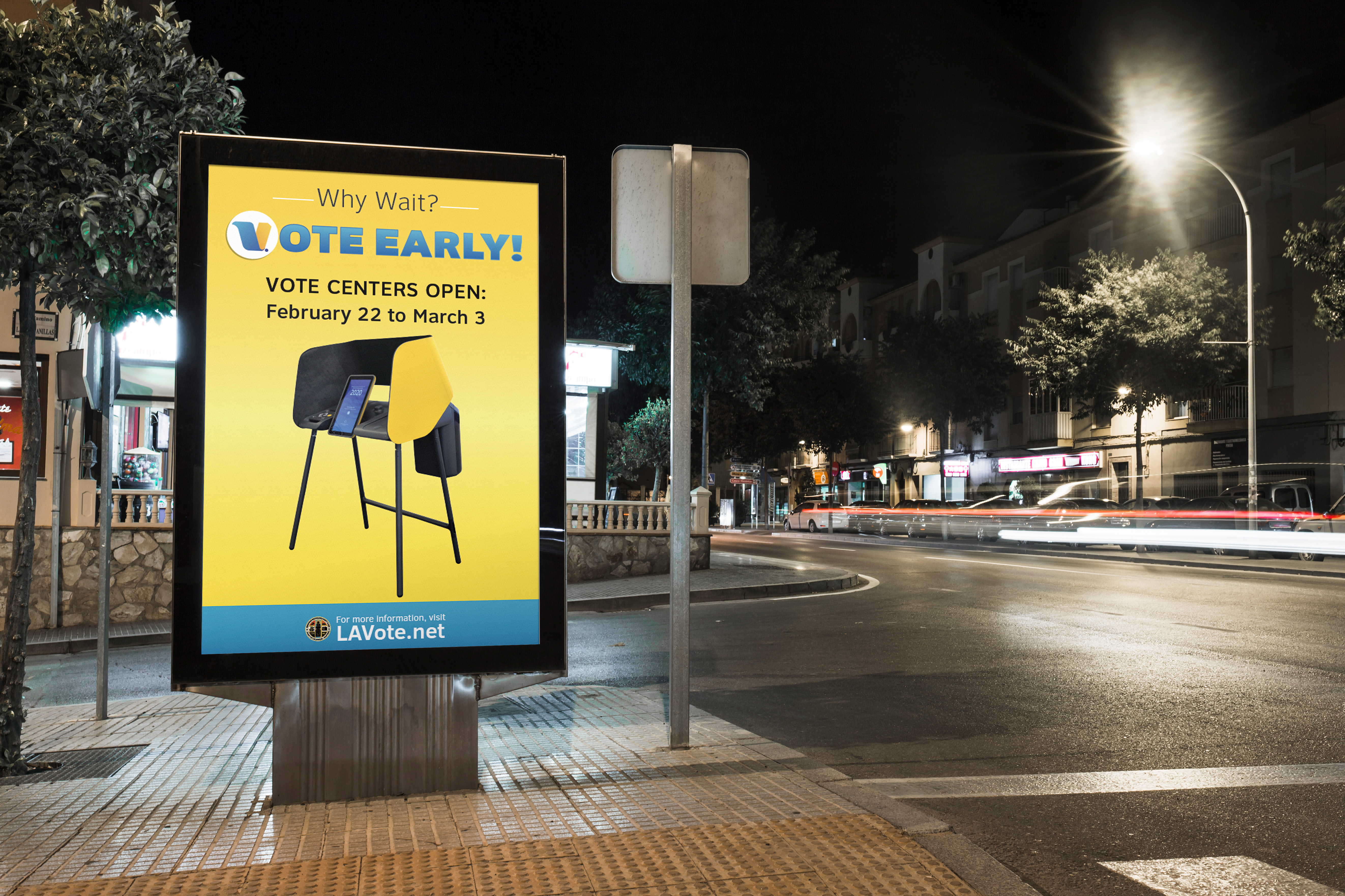
Six words maximum in the headline. One date range. One URL. Nothing else earns the space at seventy miles an hour.
Mark
The V replaces the first letter of VOTE — the only permitted logo substitution, and only at display size.
Out of home12
Brand Guide — page 13 / 18
06 — Out of homeTransit & poster
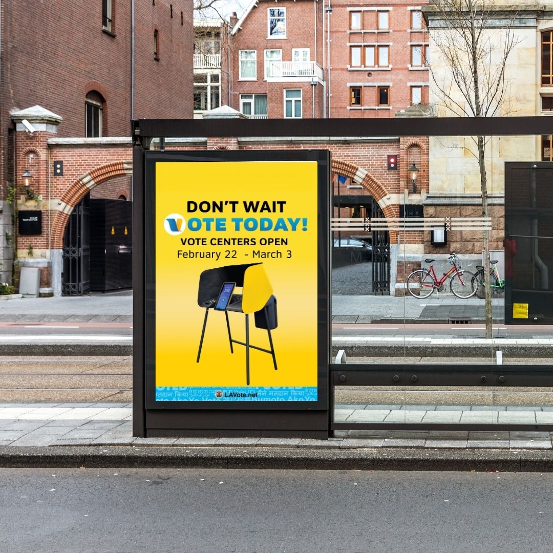
Out of home13
Brand Guide — page 14 / 18
07 — ChannelsSocial media
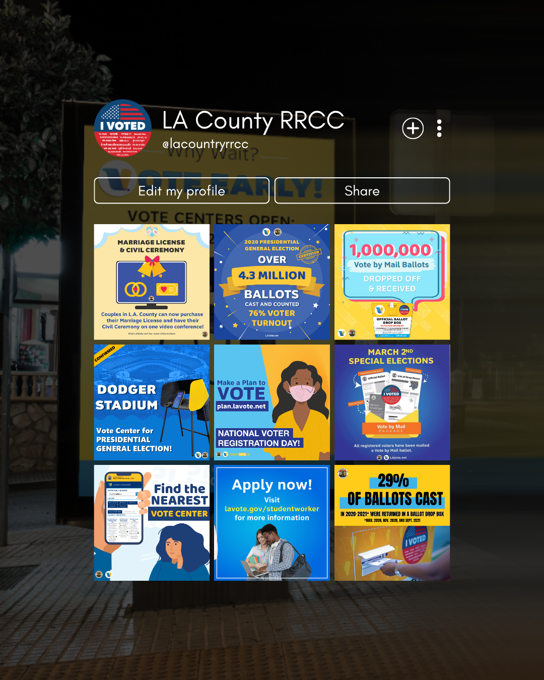
One post,
one fact,
one date.
one fact,
one date.
Social carries the calendar — deadlines, closures, milestones, pop-up services. Every post is a self-contained square that still makes sense screenshotted and forwarded without the caption.
Anatomy
Navy or spark field, never both at equal weight
Headline in caps, deck in sentence case
County seal and LAVote.net in every post
Photography, product art or flat character illustration
Headline in caps, deck in sentence case
County seal and LAVote.net in every post
Photography, product art or flat character illustration
Families
Election — navy field, spark headline, ballot artwork.
Milestone — big numeral, certified stamp, spark ribbon.
Service — photo-led, yellow banner, address block.
Seasonal — the one place a script face is permitted, for closures only.
Milestone — big numeral, certified stamp, spark ribbon.
Service — photo-led, yellow banner, address block.
Seasonal — the one place a script face is permitted, for closures only.
Sizes
1080 square for feed · 1080×1350 for reach · 1080×1920 for stories. Set the square first; the others are re-layouts, never crops.
Channels14
Brand Guide — page 15 / 18
07 — ChannelsPrint & explainers
Explain the
machinery,
then get out.
machinery,
then get out.
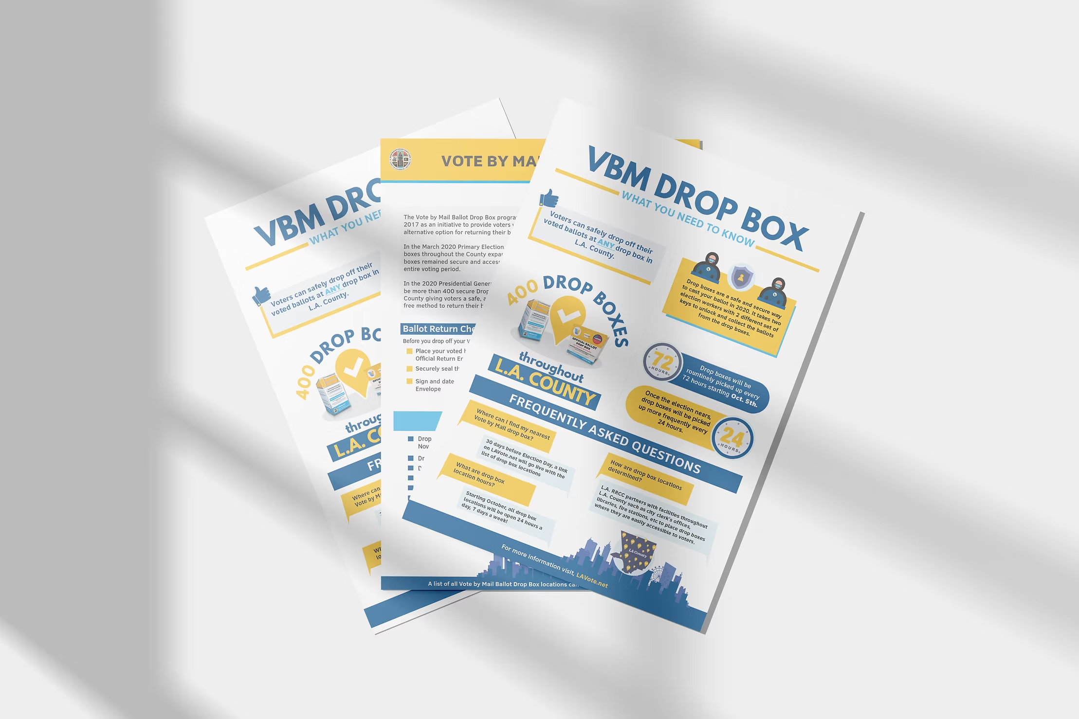
Leave-behinds answer the questions phone staff hear most. One subject per sheet, a question-and-answer spine, and a number big enough to remember — 400 drop boxes, 72 hours, 24 hours.
Structure
Spark header band, navy footer band
Answer blocks alternate sky and spark fills
Every claim carries its own number or date
Ends on LAVote.net, never on a phone number alone
Answer blocks alternate sky and spark fills
Every claim carries its own number or date
Ends on LAVote.net, never on a phone number alone
Print spec
Letter, single sided, four-colour, uncoated 80lb. Body never below 12pt. Translated editions run as separate sheets — never a two-language back-to-back.
Channels15
Brand Guide — page 16 / 18
08 — PhotographyIn the field
Show the
infrastructure,
not the emotion.
infrastructure,
not the emotion.
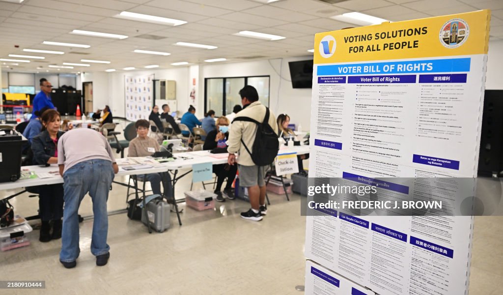
Photography documents that the system exists and works: drop boxes on real streets, vote centers with real queues, staff at real tables. Patriotic and portrait imagery has its place in campaign material — but the reference set below is the operational one.
Always
Daylight or available light
Signage legible in frame
Real locations across the county, not a studio
Signage legible in frame
Real locations across the county, not a studio
Never
Recognisable partisan material in frame
Photography16
Brand Guide — page 17 / 18
09 — VoiceTone & messaging
Write it like
a sign, not
a speech.
a sign, not
a speech.
Encouragement is fair game; instruction is the job. Whatever the line does, it also has to say how, where and by when — and survive being read once, at speed, by someone who is already late.
Five principles
01 Instruction before explanation.
02 Dates and numerals, never "soon".
03 Second person. You, not voters.
04 One action per sentence.
05 Plain language passes at grade 6.
02 Dates and numerals, never "soon".
03 Second person. You, not voters.
04 One action per sentence.
05 Plain language passes at grade 6.
Say it this way
"Vote at ANY vote center in the county."
"Vote Centers open February 22 – March 3."
"No postage necessary. Drop it in any box."
Tone by channel
SignageImperative. Four words if possible.
WebOne question per screen, one action per block.
SocialWarmer, still factual. Deadline in every post.
MailFormal, deadline first, seal visible.
PressNumbers and process. Never adjectives.
Naming
OfficeRegistrar-Recorder/County Clerk. Hyphen, slash, no spaces.
ShortRR/CC on second reference only.
ProgramVSAP — Voting Solutions for All People.
PlaceVote Center, capitalised. Not polling place.
URLLAVote.net. Capital L, A, V.
Lines that carry
Don't wait, vote now.
Vote at ANY Vote Center.
Why wait? Vote early.
Vote at ANY Vote Center.
Why wait? Vote early.
Boilerplate — 40 words
The Los Angeles County Registrar-Recorder/County Clerk runs elections and keeps vital records for the largest voting jurisdiction in the country. Under VSAP, any registered voter may cast a ballot at any vote center in the county, in twelve languages.
The read-aloud test
Read it out at a normal pace. If a listener could not repeat the deadline and the action back to you, it is not finished. Cut until they can.
Voice17
Brand Guide — page 18 / 18
10 — ReferenceQuick reference
Colour
Spark #FCC227
Interaction #2DAAE7
Structure #213F80
Ground #FFFFFF
Ink #1B2438
Slate #5b6b8c
Sky #E4F1FB
Wash #F2F6FC
Line #d7dceb
Interaction #2DAAE7
Structure #213F80
Ground #FFFFFF
Ink #1B2438
Slate #5b6b8c
Sky #E4F1FB
Wash #F2F6FC
Line #d7dceb
Type
Family Clear Sans
Weights 400 · 500 · 700
Body 16 / 1.62
Measure 66ch
Min print 12pt
Weights 400 · 500 · 700
Body 16 / 1.62
Measure 66ch
Min print 12pt
Components
Button 999px radius · 44px min height · 13/28 padding
Primary spark fill, navy text
Secondary navy fill, white text
Tertiary navy 1px outline
Card 10px radius · 1px #d7dceb
Focus 2px #2DAAE7, 2px offset
Primary spark fill, navy text
Secondary navy fill, white text
Tertiary navy 1px outline
Card 10px radius · 1px #d7dceb
Focus 2px #2DAAE7, 2px offset
Accessibility floor
4.5:1 body, 3:1 display
44px minimum target
Twelve languages at parity
Never colour alone to carry meaning
44px minimum target
Twelve languages at parity
Never colour alone to carry meaning
Do not
Two yellow buttons in one view
White text on spark or interaction
A second typeface, for any reason
Redrawn or recoloured badges
Guidance and service icons in one row
Partisan imagery of any kind
White text on spark or interaction
A second typeface, for any reason
Redrawn or recoloured badges
Guidance and service icons in one row
Partisan imagery of any kind
Questions
Anything not covered here defaults to whichever option is easier to read. If two options are equally readable, pick the one with less yellow.
LAVote.net · Registrar-Recorder/County Clerk
Reference18